Major Website Design Learning: Squarespace Makes It Fun Again
Our new Squarespace website design options—both a done-with-you process and lower priced projects—have taught me important lessons while also helping me to help clients better and to enjoy my work more.
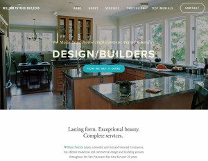
[testimonial author=”Will Lopes, owner, William Patrick Design Builders”]”The future of website design is here! Squarespace in the able hands of Jon Leland was a revelation. He guided me through a re-design more quickly, elegantly and affordably than I imagined possible. Now, I have a modern, good-looking, mobile-friendly website; AND it’s on a platform that empowers me to have FUN evolving it by myself. I couldn’t recommend Jon’s unique approach more highly.”[/testimonial]
I think the testimonial above says a ton!
As I’ve continued to experiment with Squarespace as a more cost effective and easier to use platform (vs. WordPress) for small business websites, I’ve not only learned lessons about the need for clarity in differentiating these fresh approaches; but, even more importantly, I’ve uncovered new ways of serving clients that are both better for them and more fun for me.
Not “One Size Fits All”
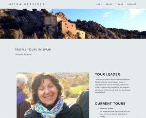
I recently did a “1-to-1 Get-It-Done” Squarespace website session with Christine Fischer via Skype. She lives in Spain and conducts Truffles Tours there.
While Christine appreciated her experience as “fun” with results that she said are “functional and elegant,” she also gave me some valuable, “constructive feedback.” She told me that she wasn’t completely clear when we started that the 1-to-1 Get-It-Done package was just a session and not a complete website project.
I was really glad that I took the time to listen to her feedback and I’ve already incorporated her suggestions by positioning the “1-to-1” offer more distinctly, as she suggested. I explained on the “1-to-1” offer page that this session is a way to build a “foundation” for your website and be empowered to move forward on your own. That much I can promise. A complete website in three hours, I can not promise.
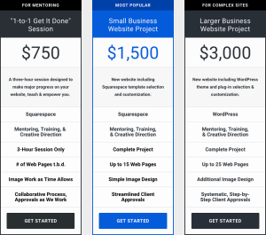
I took that input, updated the offer page and then went a extra step by creating a new 3-column chart that’s now featured on my website’s “Website Design Services” page.
A New Chart to Visualize the Differences
Now, hopefully, thanks to this chart, people can quickly and easily understand the differences between the various ways that we are now serving up new client websites.
Truthfully, for me, doing this chart was also useful because I’ve been experimenting by developing this offers and they needed to be more clearly articulated.
Now, as these new approaches to website design and development have become successful in terms of completing both sessions and projects (please see our new Squarespace website design portfolio page for examples), and, as I’m seeing 1-to-1 Get-It-Done clients complete their own websites, my whole experience with Squarespace has become more and more satisfying.
In fact, it’s become downright enjoyable!
And that’s the bottom line: I love sharing my expertise and being hands on. Doing these projects and sessions have given me a new way to be helpful and one that is empowering for clients. Yay!
Yes, Squarespace has made web design fun again.


 Creative AI shifts you can’t ignore


 Tools Change


