New Squarespace Web Design Success Story

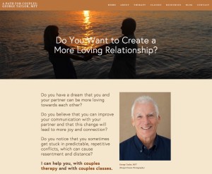
GT website screengrabWhen I first met George Taylor, I recognized him as an ideal client. He was open, honest, not afraid of technology and willing to learn.

As a result, in a relatively short period of time, we used Squarespace to give George a fresh, modern, mobile-friendly new website that has already taken his business, as well as his web presence, to a new level. 

Here’s how George described the process:

[testimonial author=”George Taylor, MFT, APathforCouples.com”]”Before I met Jon Leland, when I attempted to produce a new website and online marketing strategy, I found the Web to be a confusing maze of providers and technologies. Jon became my guide and mentor. He showed me a clear path that leads to creativity and success. He topped off his considerable expertise by being fun to work with and by evoking significant trust. I knew early on that I had made the right choice and never looked back.”[/testimonial]

Results Happen

I’m also pleased that George is following through with an online marketing strategy and implementation engagement that will include email marketing and Local SEO. But even before we got into any of that, he started attracting new clients. There was just something that worked energetically because of the collaborative quality of our working relationship.

We were essentially able to create his website together, “right before his eyes” because (as is frequently the case these days), the process of creating his new website design via Squarespace also utilized realtime screen sharing so that we could create his website and I could teach him how to make changes at the same time.

I really enjoyed the process and I’m also proud and pleased with the result.

web-design-development-options-chartIf you’d like more information about our various approaches to highly effective and extremely affordable website design, please click here.

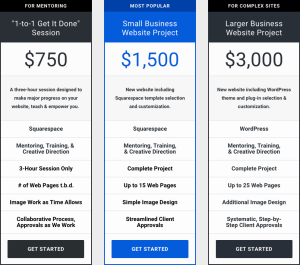
This page includes the three-column comparative chart shown to the right as well as access to both our Squarespace and WordPress web design portfolios.

I hope we can create a website design “success story” for you soon. 😉

Blab: The New Social Video Streaming Platform ROCKS!

This is a quickie post to let you know about a surprisingly good new video streaming conversation platform called Blab. I just did my first Blab session and had 39 viewers from around the world. The recorded segment is embedded below. I was joined on-screen by video participants from Brazil, Argentina, and Philadelphia. 😉

I think this application is more user-friendly for multi-user video than anything I’ve seen (Spreecast, Google Hangouts, Skype, etc.) It is also way better than Periscope or Meerkat because it’s two-way. Those video streaming tools are really only one-way.

Blab now has a mobile app as well as desktop. And, now that I think about it, it’s not only two-way, it’s up to four-way, four simultaneous video participants. And that’s nicely complemented by a fully functional chat stream where you can paste URL’s and animated GIF’s as well as very nice Twitter integration.

One of the people who jumped in, Richard Berger, had this to say about our conversation:

[testimonial author=”Richard Berger, English Teacher”]”In just those few minutes my awareness of new social media/video streaming/website development was exploded, and now you got me “back at the drawing board”, thinking of applications for my teaching work. Thanks again!”[/testimonial]

Here’s my first session which was a spontaneous “Ask Me Anything” about websites, social media marketing, video, etc. Pretty dang fun! Please click “Watch Now” button on the image below to watch this Blab session, and feel free to scroll ahead to see the multiple participants. And, please let me know what you think. And stay tuned for a special Blab next week with Twitter Power author, Joel Comm, at 4pm PT on Friday, August 28th. Thanks!

Major Website Design Learning: Squarespace Makes It Fun Again

Our new Squarespace website design options—both a done-with-you process and lower priced projects—have taught me important lessons while also helping me to help clients better and to enjoy my work more.

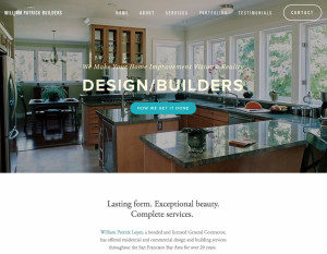
[testimonial author=”Will Lopes, owner, William Patrick Design Builders”]”The future of website design is here! Squarespace in the able hands of Jon Leland was a revelation. He guided me through a re-design more quickly, elegantly and affordably than I imagined possible. Now, I have a modern, good-looking, mobile-friendly website; AND it’s on a platform that empowers me to have FUN evolving it by myself. I couldn’t recommend Jon’s unique approach more highly.”[/testimonial]

william-patrick-buildersI think the testimonial above says a ton!

As I’ve continued to experiment with Squarespace as a more cost effective and easier to use platform (vs. WordPress) for small business websites, I’ve not only learned lessons about the need for clarity in differentiating these fresh approaches; but, even more importantly, I’ve uncovered new ways of serving clients that are both better for them and more fun for me.

Not “One Size Fits All”

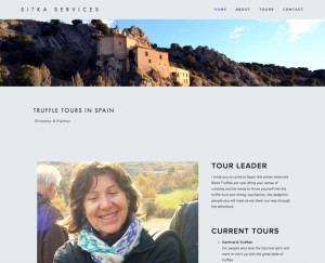
I recently did a “1-to-1 Get-It-Done” Squarespace website session with Christine Fischer via Skype. She lives in Spain and conducts Truffles Tours there.

While Christine appreciated her experience as “fun” with results that she said are “functional and elegant,” she also gave me some valuable, “constructive feedback.” sitka-servicesShe told me that she wasn’t completely clear when we started that the 1-to-1 Get-It-Done package was just a session and not a complete website project.

I was really glad that I took the time to listen to her feedback and I’ve already incorporated her suggestions by positioning the “1-to-1” offer more distinctly, as she suggested. I explained on the “1-to-1” offer page that this session is a way to build a “foundation” for your website and be empowered to move forward on your own. That much I can promise. A complete website in three hours, I can not promise. 😉

I took that input, updated the offer page and then went a extra step by creating a new 3-column chart that’s now featured on my website’s “Website Design Services” page.

A New Chart to Visualize the Differences

web-design-development-options-chartNow, hopefully, thanks to this chart, people can quickly and easily understand the differences between the various ways that we are now serving up new client websites.

Truthfully, for me, doing this chart was also useful because I’ve been experimenting by developing this offers and they needed to be more clearly articulated.

Now, as these new approaches to website design and development have become successful in terms of completing both sessions and projects (please see our new Squarespace website design portfolio page for examples), and, as I’m seeing 1-to-1 Get-It-Done clients complete their own websites, my whole experience with Squarespace has become more and more satisfying.

In fact, it’s become downright enjoyable!

And that’s the bottom line: I love sharing my expertise and being hands on. Doing these projects and sessions have given me a new way to be helpful and one that is empowering for clients. Yay!

Yes, Squarespace has made web design fun again.

Squarespace Websites Cookin’ New Client Revenue + Free Webinar Slides & Video Replay Link

There’s only one thing happier than a happy client, and that’s a happy client who is making more money as a result of their new website. And, in this case, I’m also happy because it’s one of my 1-to-1 Get-It-Done Squarespace Websites.

Larry Stroup WallpaperingReal Results

Larry Stroup is exactly the kind of small business who has benefited of my ability to get more done, well, and efficiently using Squarespace and the 1-to-1 Get-It-Done Website collaborative process. Larry is a sole proprietor wallpaper hanger and business owner in Maryland. Frankly, his old website was dated, ugly and ineffective. Now, he reports:

“I’ve been so busy from the new website’s traffic, that I’ve put off updating the photos on the site. I think the “Contact” page has really made a big difference in the amount of clients I have been getting… probably 4 or 5 times what the previous site was generating. I can’t say thanks enough!”

Another Day Another Website

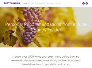
ScottsWines.com Personal Virtual Wine Sommelier Last Thursday, I had the delightful experience of taking another client Squarespace website live, ScottsWines.com. This one was for Scott Walker, a “personal virtual sommelier” in neighboring Sonoma County (FYI, as I did with Larry, Scott and I also worked together via phone and screen sharing.)
One of the fun, ease-enhancing things in this process was discovering Squarespace’s GoDaddy integration. For all of my previous Squarespace websites, I had to edit the domain’s DNS records with the client’s domain registrar (a minor technical hurdle). This time however, it took just a couple of clicks! I love that kind of ease. 😉 Click here to read the Squarespace Help file if you want more details on how this works.

Another Week Another Webinar

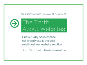
You may or may not know that I did a half-hour video webinar last week on the advantages of Squarespace over WordPress for small business websites. In many cases, these are advantages that can save small businesses $1,000’s. For your convenience and “viewing pleasure” I’m posting the SlideShare for you below; or, if you’ve got a few minutes, you can view the webinar video replay if you click here (registration required). Enjoy!

How Small Businesses Can Save $1,000’s on Websites Using Squarespace vs WordPress

Time is Money and So Is the Right Technology

The Truth About Websites-videoframeWhen it’s time for a new website or a redesign, suddenly there are some serious differences to consider when choosing the platform. Specifically, WordPress is no longer a no brainer.

I want what’s best for you, and so I research and test technologies so you don’t have to. Websites are a core component of my business, so I especially stay on top of website design platforms in order to offer you the best options.

“I know that I can count on you 100% to know the latest and greatest marketing communications technologies… You know what’s over-hyped and what’s for real… We trust you to lead us in that way.”
– Randy Haldeman, CEO, Code-N

After a very successful run with WordPress, now—for smaller businesses where simplification can save tons of money, time, and aggravation—I am now recommending Squarespace over WordPress.

I want you to understand why. So, I’m doing Free Webinar on the advantages of Squarespace over WordPress. It’s coming up this Thursday, May 28th at 10am PT. Please click here to register or continue reading. This blog post and the a personal video invitation below—as well as the webinar—include more details.

Free Webinar Registration

The savings for small businesses by using Squarespace rather than WordPress are not only direct costs, but also significant reductions in wasted time and technical hassles. The benefits of Squarespace include beautiful templates that are always responsive, a smaller learning curve, and a more efficient work flow, especially if you don’t want to always be dependent on a web designer or developer. Here’s your video invitation:

The “Done-With-You” Revolution

Plain and simple, Squarespace has helped me to help more people in a way that’s more fun, more efficient and more collaborative. While anyone can use Squarespace in Do-It-Yourself mode—and there’s nothing wrong with that—it has also enabled me to offer 1-to-1 Get-It-Done Websites that are literally one-half the cost of our WordPress customizations (which we still do for larger organizations with more complex needs).

“I’m very pleased with the 1-to-1 Get-It-Done Website session that I did with Jon Leland at ComBridges. In less than the time it takes to play a round of golf, we had my new website designed and published… Prior to this session, I had wasted many hours over a couple of months trying to update my website. I finally reached out to Jon and in just one afternoon, he saved me a ton of time, money and effort.”
— Jim Draper, President, Draper Creative Group

We call this kind of collaboration a Done-With-You service vs the more traditional Done-For-You type of service which takes considerably more time—for both the client and the vendor—as well as more money. Please click here if you want to learn more about how this service works.

How Squarespace is Different & Why This Matters

Squarespace brings together a lot of features that I’ve been looking for in a website design platform, all in one compact, hosted package that provides everything most small businesses need with almost none of the hassle. Some of the features and benefits of Squarespace that I’ll be explaining and showing in more detail during the Free Webinar include:

  • Elegant, beautiful, modern templates that are on a par with the best of WordPress.
  • All templates in the latest version of Squarespace are mobile-friendly and the responsiveness doesn’t break when you customize pages.
  • Because it’s a closed system, maintenance could not be simpler. Upgrades are built in. No plug-ins. No getting hacked. No unexpected expenses.
  • The system is user-friendly so that almost anyone can learn quickly to make their own website updates.
  • Squarespace provides 24×7 support via chat and fast-turnaround email.
  • There are an impressive array of built-in, highly-customizable features including:
    • Response forms
    • Video and audio embeds
    • Animated picture galleries
    • Editable social media icons
    • And more

And all of this is provided without having to research and shop for plug-ins and without needing to worry about possible plug-in conflicts that can be an issue with WordPress when you install and/or upgrade.

If you want to understand these benefits better, I hope you will click here to register for free for the webinar where I will explain all of this and show you as much as possible via on-screen video demos—all in less than a half hour.

Free Webinar Registration

“Who knew that creating a new website could be so fast, easy, affordable and fun? Jon is a master of all things internet, and he brings a warm and enthusiastic spirit of partnership and creativity. If you are looking for help designing a quick new website, look no further.”
— Dara Ackerman, singer-songwriter

Thanks for reading! If you’d like to follow up with me in ways other than the webinar, here are some options:

Stress Less & Get It Done! Now, We Can Co-Create Your New Low-Cost Squarespace Website

New website home page for video director, Jim Draper

New website for live event video director, Jim Draper

In less time than it takes to play a round of golf, we had my new website designed and published…”

This is just part of one of two testimonials that I’ve already received (published in their entirety below) for a new streamlined and extremely cost effective website design implementation process that I’ve just developed. Despite the fact that I’ve been a WordPress fanboy and advocate for years, this new approach utilizes the Squarespace platform and a unique from of collaboration in order to help people who have been struggling to create a website get one up and running in record time.

At the end of day, I am the kind of guy who enjoys finding and recommending simpler solutions that can help small businesses to be more effective online, and I want to help them to do more more easily, with a minimum of stress. That’s why I’ve developed this entirely new approach.

Streamlining Through a Collaborative Process

The name for this offer was inspired by copy-writing coach and friend, Lisa Canfield, who says that when she’s collaborating with clients, “I’m working one-on-one and just gettin’ it done.” With Lisa’s permission, I’ve decided to call my new offer: “1-to-1 Get-It-Done Websites.” Cool name, eh?

Much to my own surprise, I’ve discovered that I can help small businesses get entire websites (or at least most of it) designed and produced within a single one-on-one session (either in person or via screen sharing). Without marketing this offer, I’ve already completed two of this new kind of website design session. It’s been fun for me, and I’ve thoroughly enjoyed the process due to the joy of collaboration, the satisfaction of being extremely productive (so many people get stuck in the process of trying to get a website done), and rewarding for both me and the client because of the tangible, visible results. If you are interested, please scroll down to the end of this post for a special savings offer that is only available for the next three clients who commit to doing a 1-to-1 Get-It-Done Website design session.

Success Times Two

Live event, multi-camera video director, Jim Draper, needed a re-design of his out-dated website. As he says below, he struggled for months and wasted many hours before we sat down to create Jim’s new 1-to-1 Get-It-Done Website:

I’m very pleased with the 1-to-1 Get-It-Done Website session that I just did with Jon Leland at ComBridges. In less than the time it takes to play a round of golf, we had my new website designed and published. I particularly enjoyed the collaborative process with Jon. We were able to share, implement and execute ideas together; and I’m very excited about the result.
Prior to this session, I had wasted many hours over a couple of months trying to update my website, but I could’t get the look that I wanted. I finally reached out to Jon and in just one afternoon, he saved me a ton of time, money and effort. In my opinion, the combination of Jon’s expertise and this streamlined process is a real winner. If you want to get your website done with a minimum of stress, I don’t think there’s a better way.
— Jim Draper, President, Draper Creative Group

Click here to check out Jim’s new website

The other 1-to-1 Get-It-Done Website production that I’ve done so far was for local singer-songwriter, Dara Ackerman. She offered these words of appreciation for the value of this collaborative process:

Sitting together with Jon Leland for three short hours, brainstorming a plan, bouncing ideas off each other as we collaborated every step of the way, and then watching them materialize as eight beautiful webpages was a thrill and delight. Who knew that creating a new website could be so fast, easy, affordable and fun? Jon is a master of all things internet, and he brings a warm and enthusiastic spirit of partnership and creativity. If you are looking for help designing a quick new website, look no further. An added benefit was being exposed to the Squarespace platform as we went along. This has made it easy for me to make changes and additions on my own afterwards. Thank you, Jon, I am very excited to finally have a new website that I can be proud of!
                                             — Dara Ackerman, singer-songwriter 

Learn More

You’ll be amazed at how productive we can be together with this platform and approach. Together, you and I will collaborate and build the foundation of your new site’s structure and your new site’s look and feel based on one of Squarespace’s beautiful templates. If you would like more details about how this works, please check out this page for more info. The “Get Details” link at the bottom of that page provides a complimentary worksheet that will set you up for an efficient and productive session. Thanks! I look forward to your feedback, and please let me know if you have any questions.

3 Videos That Inspired My Business & My Life Last Week

Jim Carrey QuoteReady for take off? It feels that way to me. Astrologers tell me that when Mercury goes direct on Tuesday, it’s “all systems go!” For me, the latest signs of expansion have come in the form of three videos that showed up in my social streams last week. This clips (all embedded for your viewing pleasure below) inspired and uplifted me by reminding me of what life and business is all about. I feel more hopeful and excited about what I am creating that maybe ever before. No kidding.

As some of you are aware, I am focusing the foundation of my business marketing communications more and more around my values of ease, fun and authenticity. These videos hit home and struck harmonious chords for me along these lines and then, went deeper. All three speakers—comedian, movie star Jim Carrey; successful entrepreneur Tina Roth Eisenberg a.k.a. SwissMiss; and best selling author of “Red, Hot & Holy,” Sera Peak—are willing to “think different.” Each of these shining examples doesn’t even consider “the box” when they think and, more importantly, they consistently act outside of it.

Jim Carrey: Freedom From Concern

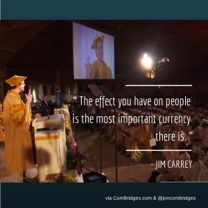
This commencement address at the Maharishi University of Management is a joy. And, it speaks to me about the heart of social media marketing as well. For example, he says:

“The effect you have on others is the most valuable currency there is.”

That’s right. It’s not about the money. “The Experience Economy” is based on how people feel, the effect you have on them, when they grant you a bit of their preciously scarce attention. Carrey really walks his talk about “Freedom from Concern” and he implores you to listen to “your joyful heart.” I think what he says is important.

Tina Roth Eisenberg: Don’t Forget to Play

For some people, it’s a stretch to talk about having fun while working. Not for blogger/designer/entrepreneur, SwissMiss (whose real name is above). She tells the story of her amazing journey from graphic designer to owner of five thriving businesses and mother of two far better than I can summarize. Bottom line for me, she seems to be enjoying herself and the learning process every step of the way. Beyond the fun quotient, is the way she has so clearly found her own unique business path and built her businesses on her own terms by making her people a real priority. Thus, Tina exemplifies, for me at least, how enjoyable and rewarding the business journey can really be. I like that. I really like that. 🙂

Sera Peak: Listening to a Power Greater Than Yourself

Rarely do we see an individual willing to expose her own “Truth Bombs on the Soul Path.” We’ve all had major insights and realizations, and rarely do they make us look good. One of the core values of authenticity is telling the truth no matter what. This video exposes this best-selling author’s learning process on her way to ever-deepening spiritual growth, and she does so with a kind of transparency that I believe uplifts us all. That’s what I call inspiration.


My New Favorite iPad Video App: Adobe Voice

Riding the Wave

The major trend in social media marketing that I call “The Visual Web” is becoming increasingly important. Fortunately, I’ve found a new iPad app that makes creating animated videos both FUN and EASY. I like that. 😉

If you still haven’t jumped into creating your own videos and visuals, I’ve got one quickie example for you below, and perhaps this quote from a true, social media marketing thought leader will also inspire you?

“From a trend standpoint, the trend towards visuals in inescapable... Everything that people are paying attention to now fundamentally has pictures or video.” — Jay Baer’s video blog post, Why Visuals Are the Most Important Element of Content Marketing

create quick easy videos on iPad with adobe voiceiPad as New Easier Authoring Platform

For me, being able to create on the iPad, without a mouse or trackpad, sitting in my easy chair is more fun and relaxing than sitting in front of a computer, even a light laptop. As an innovator, I also notice the creative juice that flows through the Apple’s iPad eco-system. The fact is that this app as well as others that I use regularly—like Paper from Fiftythree.com—are iPad-only apps… and, by the way, they are also both totally free.

Quick, Easy Animated Videos with Adobe’s New Voice App

Last weekend, I heard about Adobe’s new free iPad app called Voice. It uses your voice as a sound track. You record the audio one scene at a time. Lots of templates, clip art and royalty free photos are included. I found it to be a positive experience and intend to put it to further use.

Below is my first test video created with Adobe Voice in about 20 minutes. Not bad for my first time out.

One lesson that I learned in the process is that next time I will keep all of the individual scene audio snippets shorter. It would also be nice for the app to enable you to post your videos to YouTube and other video hosting services. Right now, you can share a link, post to social media, or use an HTML embed code as I have done below; but I’d have to re-record it with a screen capture program in order to post it to my YouTube Channel.

Otherwise, I liked the user experience a lot and once I really get the hang of this production time will be even faster. Overall, using Voice was fun and I think it’s a great new option for communicating on The Visual Web.

Learn How Compelling Visual Content Can Increase Your Social Media Marketing ROI

In a blog post over two years ago (see Social Media Goes Visual: Why Pinterest is More Than You Think), I started calling the next frontier of social media marketing, “The Visual Web. This morning, I extended this conversation with a Google Hangout interview with Ekaterina Walter, the author of “The Power of Visual Storytelling.” Here’s that 30 minute conversation:

Fundamentally, humans are predominantly visual creatures, and according to a study from National Formosa University in Taiwan, this is reflected in our computer environments—especially in this age of social media!

Bottom line, you may produce the most compelling written content for your business blog and social media marketing efforts, but if you don’t have the right visual content to make it more engaging, you may never see decent conversion rates.

Here are some basic tips (with more to come) as to how to effectively use visual content to engage readers and get a better ROI:

Vary Your Media

To effectively promote content in social media, mix up what kind of visual content you’re using.

  • Photos. Whether you’re using your own photographs, stock photography or a digital vector, you’re going to need a relevant image(s) to go along with your content. Case in point: Marketing blogger Jeff Bullas reports that articles with images get 94 percent more views, and on Facebook, photos get 84 percent more click-throughs than their counterpart text-based posts, according to Kissmetrics. Failing to add a photo can mean a major loss of conversion. Also, let’s face it—the article just looks nicer with an image or two.
  • Video. Integrating video into your social media campaign not only grabs people’s attention, but it helps you stand out as an authority in your field. To create customized video about your area of expertise, use a marketing service like ComBridges or just shoot and upload via YouTube, or use Google Hangouts On-Air as I have done above. If you simply need royalty-free stock video, try a site like Shutterstock.
  • Animated GIFs. Sites like Buzzfeed, Distractify and Tumblr use animated GIFs frequently. These sites get shares into the tens of thousands and views into the millions. With the widespread use of broadband, these kinds of images are far more high-tech and user-friendly than they used to be. They’re a great way to market pop culture events or tutorials without requiring the user to watch a video. If you’re trying to get a quick point across, use a GIF.
  • Infographics. Your target audience may not want to read a wall of text. Instead, offer them quick and easily accessible information (with credible sources) in the form of a visually engaging infographic. In fact, infographics have become so popular in recent years, you can search for just about any topic you’re interested in followed by the word “infographic,” and chances are, there is one available.

And all of this is just the beginning. In future posts, I’ll write more about things like Instagram, Pinterest, SlideShare and more. Please subscribe via the links above to be notified.

Keep Color Psychology in Mind

Because “The Visual Web” is all about graphics and images, color is key. Color sets off certain signals in your brain, even if you’re not aware of it. For example, the color red is exciting and stimulating, while blue is considered calming and trustworthy. Take a look at different business logos and advertisements as you’re driving down the street. Note what kind of an emotional appeal they have for you. Use this same type of approach in your social media efforts. Depending on the emotional response you want to convey, choose your imagery and colors within the content carefully. Visual.ly has a great infographic on the psychology of color that can help you make good color choices for your social content.

More to come! I look forward to your feedback and your shares. 😉

[hr style=”1,2,3,4″ margin=”40px 0px 40px 0px”]

Need help with your Internet marketing strategies?
Jon Leland’s “CSO-to-Go” packages start as low as $498.
Click here to find out more

Video Rant Reveals the Surprising ROI of Leading with Values

I’m turning a corner in my business. I’ve realized that my values are the more important than my (so called) value proposition. And the real eye opener for me was the way that my business coach explained that this approach can actually open up new revenues. Values = $$? Really?

This blog post explains the fortuitous way that I experienced this strategy directly, and how you can use it as an inspiration for your own online marketing communications…

Values Trump Values Proposition

Why Our Values ARE Our Value

The foundation for this story is the way that I’m discovering that my core values of ease, fun and authenticity have become even more important than our company’s skills and talents with Internet marketing strategy, website design, video production, social media marketing, SEO and the rest. 

Radical, eh?

Sometimes this kind of branding/positioning is as simple as adding a line about these values to an email of introduction (and, yes, just last week a prospective client made a point of telling me that she appreciated the fact that these values were included in my email. There was an added element of rapport created even before we spoke on the phone).

This values-based approach really gets juicy when it’s applied to a new breed of video that I’m calling a “rant.” Rant videos are further explained and illustrated below.

Another unexpected result of this awakening for me is that my long-established axiom of “Leading with Value” (Key Concept #8 in my book) is causing me to choose to position myself and my company’s work more clearly around our own core values.

How Audacious Authenticity Can Attract New Revenues

“When you reveal your passion for being of service through your business in the boldest, most transparent and vulnerable way possible—for example, in a series of online video rants about things you care most about—this does more now for opening up revenue flow than almost anything else, particularly if other things have failed and you find yourself extremely stuck. Video is THE medium that carries genuine emotion the very best, online. Use video to allow money to find you, as a reflection of the full expression of your heart.” — Andrea J. Lee, WealthyThoughtLeader.com

The video above is my latest experience with both real time marketing and the art of the video rant.

My friend and client, veteran executive coach and management consultant, Nancy Monson and I were having a marketing consulting session. The day before I had been on a group coaching call with Andrea J. Lee where she had said what’s quoted above about the power of the video rant to both reveal passion and open revenue flows. As I directed Nancy to speak her truth about why most executive coaching doesn’t produce the desired results, she lit up. Recognizing that we were getting to the heart of her values and her commitment to make a meaningful difference, I said, “Let’s capture this, so we don’t have to write it down.” At first she thought I was going to make an audio note. But, after a slight hesitation, she agreed to let me record this video with my iPhone.

The video rant above is the result. I salute Nancy for her courage to swing out in this way and I’m pleased with how her knowledge and commitment to results have been made visible.

The Zen of the Real Time Rant

rant quote“The art and science of marketing is now about focusing on real-time connections and social exchanges.” 
Vocus blog post

It’s widely recognized that because of the explosion of social media and mobile communications, real time communications are the leading edge of what I call New Marketing. What better way to leverage these trends along side the New Marketing requirements for authenticity and engagement than with a video that is spoken with passion, from the heart? (And, it’s easy to see why formal production values are not required.)

More to come. I look forward to your feedback; and by all means, if you like what you’ve read and seen here, please share in every way possible (links below). Thank you! 🙂

PS. If you are interested in bringing more of your authentic passion and core values to your online marketing, please contact us. We’d love to help.